Prio - Designing calm under pressure
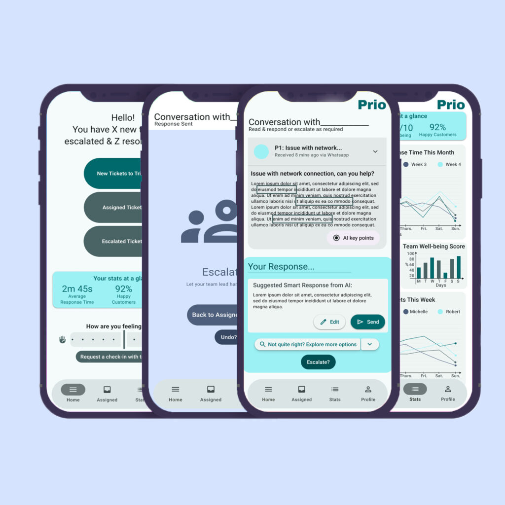
Customer support tools often optimise for speed, visibility, and scale.
Prio explores a different priority: clarity, judgement, and emotional sustainability in high-pressure work.
This project focuses on how interface decisions shape not just efficiency, but the experience of working, especially for remote agents navigating constant demand.
Project Snapshot
Product Overview
Prio is a mobile-first customer support app designed for remote agents managing high ticket volumes in emotionally demanding environments.
The goal was to reduce cognitive overload, improve prioritisation, and create a more grounded, manageable workflow – without removing professional autonomy.
Rather than adding more features, this mobile SaaS app centres on intentional reduction: fewer decisions, clearer signals, and calmer defaults.
Role
UX/UI Designer (end-to-end)
Tools
Figma, FigJam, Google Docs, Adobe Photoshop
Timeline
March – October 2025
Why This Problem Deserved Attention
Customer service burnout rarely comes from a single failure point. It accumulates through constant context switching, emotional labour, and unclear priorities repeated throughout the day.
Agents are expected to move quickly, remain empathetic, and make judgement calls with limited context – often across multiple conversations at once. Most existing tools assume agents should adapt to complexity. Over time, this expectation becomes unsustainable.
Prio treats focus, composure, and clarity as performance enablers – not soft benefits. When tools support judgement instead of demanding it, people work better and last longer.
Constraints & Operating Realities
Every design decision was shaped by real world limitations.
Structural constraints
Mobile-first use in non ideal environments,
Continuous inflow of high-priority requests,
Emotionally charged conversations requiring care and accuracy,
Limited time for deep analysis per ticket.
Project constraints
- Solo designer, no engineering support,
- Time-boxed free time context,
- AI features explored at a conceptual level,
- Limited ability to measure long-term behavioural impact.
Rather than aiming for an ideal system, I focused on credible, well-reasoned improvements that could realistically exist within modern support workflows.
The Reality Agents Are Working With
Cognitive Overload
Too many incoming tickets, cluttered dashboards, and constant notifications make it hard for agents to orient themselves – especially at the start of a shift.
Repetitive Tasks
Agents often rewrite the same responses with small variations, draining time and mental energy that could be spent resolving complex issues.
Difficulty Prioritising
Without clear hierarchy or meaningful labels, urgent tickets blend into long lists – increasing stress and delaying important responses.
Stress & Burnout
Remote agents lack visible signals for workload pressure, support needs, or breaks, making burnout easy to miss until it’s too late.
If these problems are not addressed, agents don’t just work slower – they disengage.
Design Approach
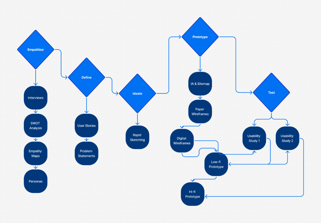
Rather than following a rigid UX process, I focused on three guiding priorities:
Reduce decision fatigue before adding features,
Surface what matters now – not everything at once,
Design for emotional sustainability – not just efficiency.
This meant editing aggressively, not every insight became a feature, and not every feature made it into the final design.
User Research & judgement
I combined secondary research with interviews to understand how agents actually experience high-volume support work.
Several themes emerged, but not all were acted on equally.
What I prioritised
Signals that reduced cognitive load immediately,
Support for repetitive work without removing agency,
Clear visual hierarchy over advanced tooling.
What I deprioritised
Manager-level reporting features,
Deep analytics dashboards,
Extensive customisation early in the flow.
These decisions were intentional: agents needed clarity first, flexibility second.
Competitive Landscape
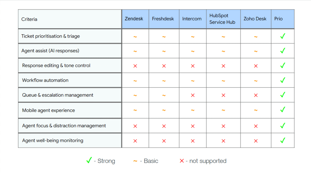
Most existing customer support tools optimise for centralisation, feature breadth & channel coverage. What they sacrifice is calm.
Many dashboards surface too much information at once, assuming power users will adapt. Prio takes a different stance – it assumes cognitive load is already high, and the interface should do more of the organising work upfront.
This perspective directly influenced layout, hierarchy, and feature restraint.
Core Design Principles
These principles guided every design decision:
Clarity over density,
Assistance without loss of control,
Calm is a performance feature,
Flexibility should appear only when needed.
When trade-offs came up, these principles helped determine what stayed – and what was cut.
Information Architecture
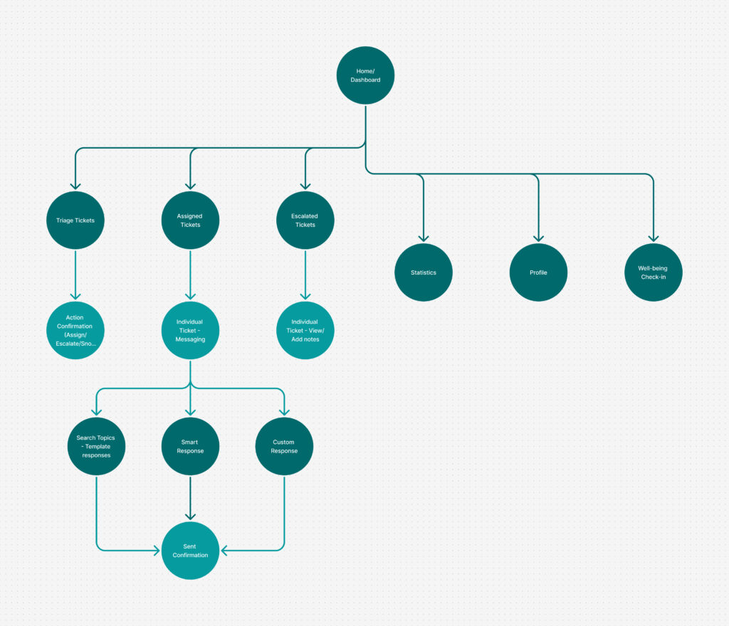
Early IA included:
- advanced filtering,
- multiple parallel task paths,
- visible secondary actions at all times.
Why I removed these:
- increased visual noise,
- slowed first decisions,
- asked agents to think too much too early.
The final structure prioritises a single, clear starting point, with secondary actions revealed progressively.
From Early Wireframes to Final UI
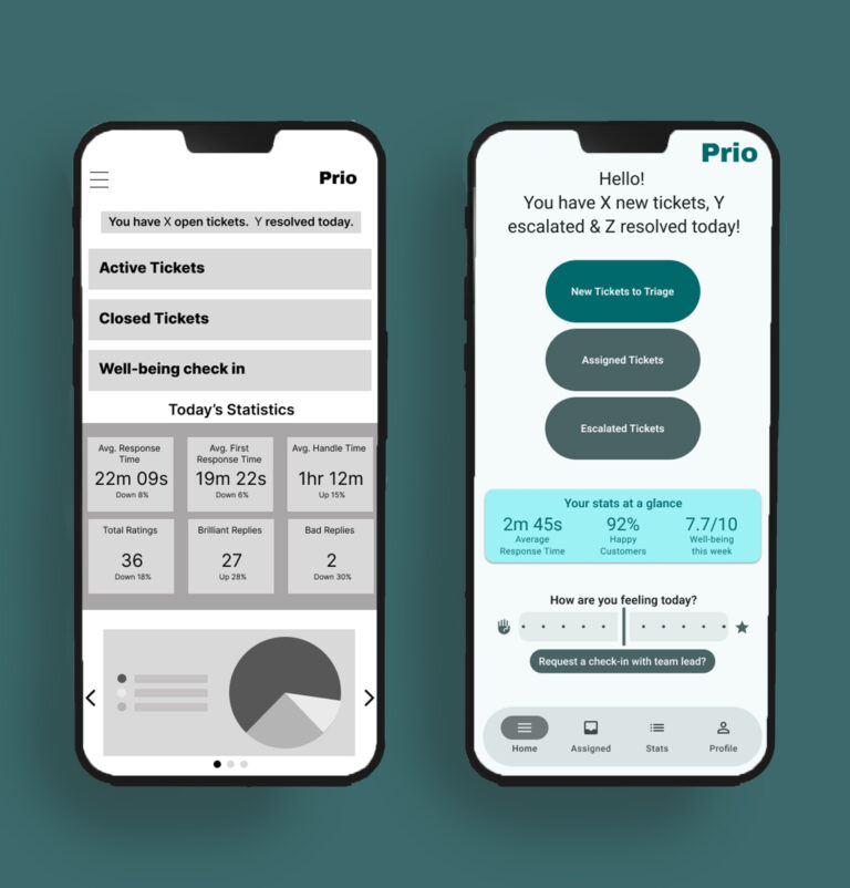
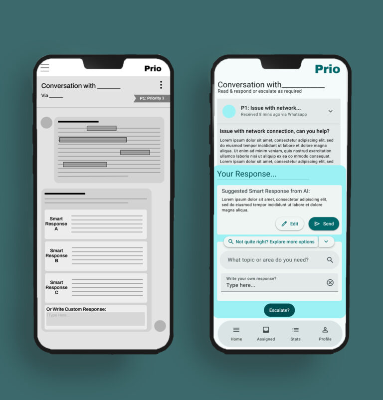
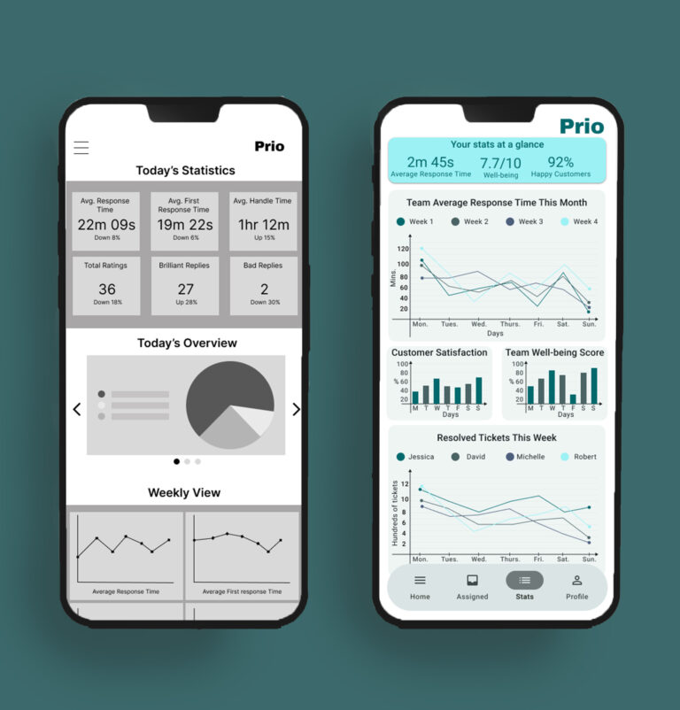
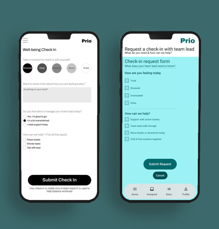
Key Decisions:
Simplified ticket cards to highlight urgency first,
Reduced simultaneous action options,
Introduced AI summaries as support, not replacement.
What I resisted:
Over-automating responses,
Gamifying productivity,
Adding wellbeing features that felt performative.
Each refinement aimed to lower effort without removing autonomy.
Final Design
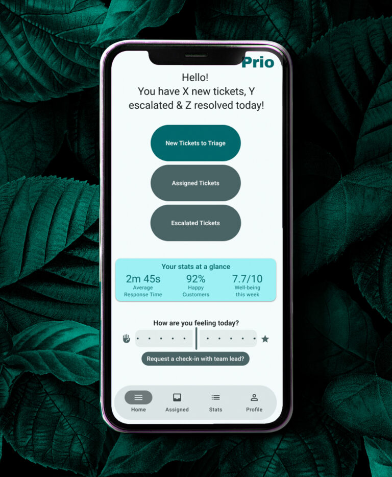
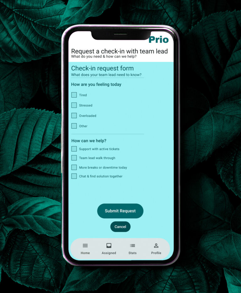
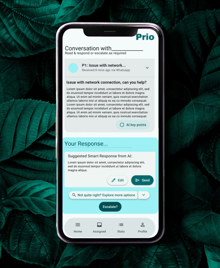
The final design centres on:
a calm, spacious dashboard,
clear visual hierarchy,
smart response suggestions that remain optional,
subtle wellbeing check-ins that respect professional tone.
The result is an interface that supports focus rather than competing for attention.
Accessibility & Inclusion
Accessibility decisions were embedded throughout the design:
Strong contrast and consistent text sizing,
Paired icons and labels,
Calm, neutral language in wellbeing prompts.
These choices support users with visual or cognitive processing challenges and improve usability for everyone.
Reflection: What this project taught me
This project reinforced a belief I carry into all my work:
Good product design doesn’t just help people do more – it helps them last longer.
I learned the value of:
editing ruthlessly,
designing for emotional context,
treating calm as a design outcome.
Most importantly, I was reminded that what you choose not to build is often as important as what you ship.
Next Steps
With more time and engineering support, I would:
Validate long-term impact on agent stress and satisfaction,
Explore adaptive prioritisation based on workload patterns,
Continue refining accessibility and micro-interactions.